[ad_1]
by Kevin Schofield
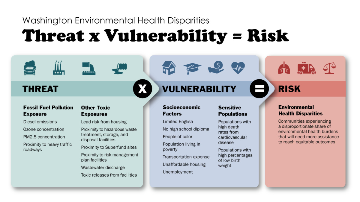
Last month, the Washington State Department of Health (DOH) released an updated “Washington Environmental Health Disparities Map” for the state. It calculates the environmental risks for communities throughout the state, in terms of the potential negative impacts to their health.
There are three steps to its analysis. First, it compiled data on a wide array of environmental hazards, both general pollutants as well as sites of specific toxic exposures; together, they paint a picture of the total threats a community might face. Second, it assesses a community’s vulnerability to those threats: the presence of chronic health issues, such as cardiovascular disease and low-birth-weight infants, as well as several socioeconomic factors (poverty, unemployment, low education levels, etc.) that correlate with increased health risks. Third, it combines the threat and vulnerability assessments to generate an overall risk rate — one that can be used to compare communities.

Here in the Puget Sound area, we know we have a confluence of both environmental hazards and vulnerable communities. We are a large economic center and transportation hub, with sources of residential, commercial, industrial, transportation, aviation, and maritime pollution — and we have a long history of accumulating environmental hazards, such as Superfund sites and an outdated wastewater treatment that occasionally dumps raw sewage into public waterways. We also have historically marginalized communities that are often located next to heavy industrial polluters and disproportionately suffering from health conditions. The economic disparities in these communities also limit both the financial resources and the political power they can use to try to address the added environmental health risks they face.
We know all this. It’s been well documented and it is frequently discussed. This new report provides additional evidence and confirms many things we already knew either anecdotally or through previous studies. Yet we also must acknowledge that when all is said and done, there’s a lot more said than done: Progress on addressing these environmental health risks has been too slow, and the environmental justice movement is right to push for change.
But while recognizing all that and not in any way diminishing the importance of addressing the environmental health risks here in the Puget Sound area, this report gives us an opportunity for an equally important discussion we too rarely have in Seattle: what’s going on in the rest of the state.
The bulk of the report is a collection of 20 maps of our state: the overall risk analysis, and the individual data for each of the 19 factors that feed the risk calculation. Each map includes a few pages explaining where the data comes from and how it should be interpreted. Here’s the top-level risk map:

Each region represents a census tract and is color-coded on a scale of 1 to 10, where 10 represents the 10% of tracts most impacted, and 1 is the 10% least impacted. As expected, we can see heavy impacts in the greater Puget Sound area, as well as the major industrial ports, greater Spokane, and several areas in southern and central Washington.
But when we dive further into the details, we begin to see there’s much more going on than this one map portrays. The report can make it a bit difficult to understand the broader pattern, because the 20 maps are so dispersed, but pulling them together — as we’re about to do — clarifies things.
Let’s begin with the environmental hazards. The maps for diesel-exhaust PM 2.5 pollution and for the presence of heavy vehicle traffic show what one would expect: high concentrations along the I-5 corridor, at our state’s major ports, and in Spokane.


But the maps for more generalized PM2.5 and ozone pollution show a completely different picture: Central and Eastern Washington are hit hard. Some of this is agricultural activity, but a large portion is due to forest fires — both the greater severity of fires and the lengthening fire season.


Equally alarming is the map for one more widespread environmental hazard: lead in our homes, including both lead paint and lead pipes. The Olympic Peninsula, central Washington, and Eastern Washington all have many communities that are highly impacted by this.

The maps of some of our state’s other, more localized environmental exposures remind us that our past environmental sins were committed at scattered locations around the state, sites tied to logging, shipping, coal and oil, maritime activity, and military operations. The U.S. Environmental Protection Agency tracks 69 Superfund sites alone in Washington.


Beyond the scattered hazardous sites, the government also tracks locations of polluted wastewater discharge as well as sites where extremely hazardous chemicals are stored or processed, those so hazardous that the Feds require the site operator to have a “Risk Management Program” plan on file to deal with any future spill. Those maps show a much more disparate impact outside of the Puget Sound area, and particularly in southeastern Washington.


Together, these maps show that the whole state faces environmental health hazards. But how vulnerable is the rest of the state to those hazards? (Spoiler: very.) The maps on the prevalence of cardiovascular disease and low-birth-weight babies are sobering; they are issues for communities throughout the state:


These are two health issues that are tied to the larger economic health of communities, including whether people have the money to buy healthy food and to seek medical care. And three basic economic indicators — the number of people living in poverty, the number without a high school diploma, and the number unemployed — are heart-wrenching. Here in the Seattle area, the economy may be roaring back, but on the Olympic Peninsula and in many parts of central and Eastern Washington, there is still widespread economic hardship.


Another key economic indicator, housing affordability, shows that the greatest issues are concentrated around Puget Sound, with a handful of scattered hot spots. But as the report points out, housing affordability and transportation expenses are joined at the hip: Beyond the Seattle area, the housing may be cheaper, but transportation is a much larger household cost. In fact, the two maps are nearly the reverse of each other:


And finally, the report looks at race and English language proficiency, both of which have been connected to disparities in socioeconomic outcomes and the ability to gain access to community resources. The map highlights two kinds of Communities of Color outside of Puget Sound: Indigenous tribes living on tribal lands, and largely Hispanic communities of agricultural workers in central Washington. If you thought everything east of the Cascades was white and homogenous, you thought wrong.


The report ends with a look at the real-world impact, today, of environmental health disparities: The communities with the lowest impact have a life expectancy five years longer than those with the highest impact.
Put together, these 20 maps tell us two things. First, recalling that the environmental health risk is a combination of both hazards and vulnerability, we see that outside of Puget Sound, the hazards are generally more scattered, but the vulnerability is widespread. The one exception is the increasing hazard from wildfires, which could easily have an outsized impact across the state given the underlying vulnerabilities that already exist and the increasing severity of climate change. But today, even if the “big picture” map downplays the environmental health risks for communities outside of Puget Sound, all the fundamental pieces are in place for that to change quickly.
Second — and once again, without diminishing the severity or importance of the socioeconomic issues facing disadvantaged communities in the greater Seattle area — some of the grievances we hear from our red-county neighbors on the other side of the Cascades are not entirely without merit. They are also dealing with poverty, unemployment, struggling Communities of Color, basic cost-of-living issues, and health problems. Olympia is far away from them, and their elected officials are in the political minority, so it’s not surprising that many feel unseen and unsupported. Their education system has failed them, and that makes it harder for them to get good information — and better jobs. We don’t have to buy into the culture wars, and we certainly don’t have to agree with every idea that Washington Republicans assert, but we can remember that there are vulnerable communities in every corner of our state, meet our neighbors where they are, and find common ground. They, too, deserve environmental justice.
Washington Environmental Health Disparities Map

Kevin Schofield is a freelance writer and publishes Seattle Paper Trail. Previously he worked for Microsoft, published Seattle City Council Insight, co-hosted the “Seattle News, Views and Brews” podcast, and raised two daughters as a single dad. He serves on the Board of Directors of Woodland Park Zoo, where he also volunteers.
📸 Featured Image: Graphic showing the formula the authors used to calculate risk to communities, via the “Washington Environmental Health Disparities Map Technical Report”; used with permission.
Before you move on to the next story …
Please consider that the article you just read was made possible by the generous financial support of donors and sponsors. The Emerald is a BIPOC-led nonprofit news outlet with the mission of offering a wider lens of our region’s most diverse, least affluent, and woefully under-reported communities. Please consider making a one-time gift or, better yet, joining our Rainmaker Family by becoming a monthly donor. Your support will help provide fair pay for our journalists and enable them to continue writing the important stories that offer relevant news, information, and analysis. Support the Emerald!
[ad_2]
Source link